

Cartogram maps
A cartogram is a map in which some thematic mapping variable – such as population – is substituted for land area. The geometry or space of the map is distorted in order to convey the information of this alternate variable. An area cartogram is sometimes referred to as a value-by-area map or an isodemographic map, the latter particularly for a population cartogram, which illustrates the relative sizes of the populations by scaling the each area in proportion to its population. The shape and relative location of each country is retained to as large an extent as possible, but inevitably a large amount of distortion results. (edited from Wikipedia)
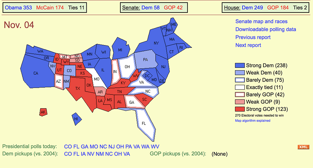
November 4, 2008 election day cartogram shows the relative sizes of states based on electoral votes, which is based on population.
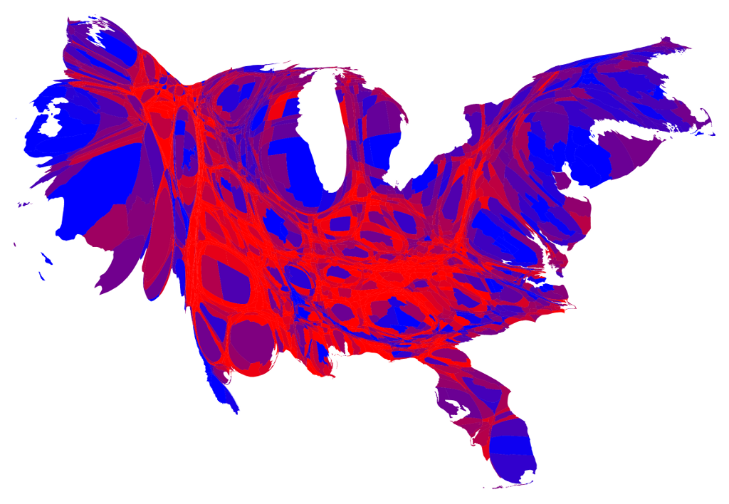
Even more striking is the cartogram based on results by county: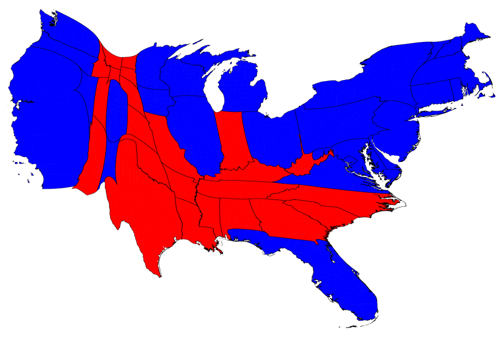
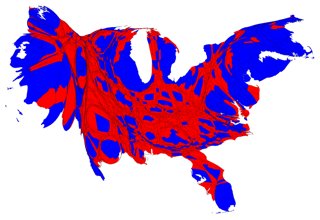
One way to include more nuance in the map is to add shades of purple to indicate the percentage of votes, with solid red or blue to show counties with 70% or more partisan votes.
For more cartograms, see 2012 election results cartograms
Cartograms can be used to describe social and economic realities.
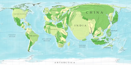
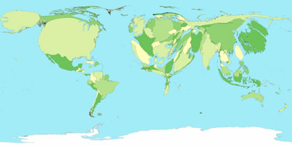
World Population and World Energy Consumption
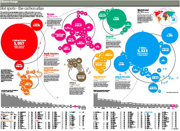
Double-page spread from Mark McCormick’s December 15, 2007 graphic in The Guardian (Britain) titled “Carbon Atlas” showing off a style of cartogram named Doring.